Monday, August 22, 2011

Lighting

Lighting is really difficult! Illumination is like sound; it has so many qualities that finding what you want is more luck on the part of the consumer than anything else. Lights can be more or less strong, more or less directional, and it simply isn't something you can work out in a lighting shop, surrounded by other light sources. Some spotlights, for example, are really for security lighting; others are less concentrated and will provide comfortable light for outdoor dining.

Lighting shops, in my experience, are usually filled with astonishingly ugly fittings. Some years ago we discovered Beacon Lighting. Their shops tend to be at least 60% attractive fittings, and even the unattractive ones aren't that bad, except maybe for this one:

How on earth could anyone think this was attractive? Let alone practical! But I digress.

We ended up with the following, all from Beacon Lighting:


Kitchen Triple LED spotlights on bracket, LEDS for under wall cupboards
Family Room LED downlights, stainless steel Typhoon fan
Study Laconia pendant
Entry Recycle a fitting
Kids' Playroom Rocket light
Stairs Project wall sconce
Patio Sentinel spotlights
HTML Tables

And here are the problems we encountered along the way.

Choice: it's hard to know exactly what you want, and whether it will provide adequate illumination. In some areas, like exposed outdoor lighting, the range is very small. This can mean you choose very quickly, or that you go away thinking, "None of the above!" Even without the returns we made, several shopping trips would have been necessary just to decide on fittings. On the positive side, Beacon were always very accommodating with returns and so on, and their staff are friendly and helpful (if occasionally short on technical knowledge).

Vue from Beacon, for our kitchen, was an easy decision. Few of these rail-type fittings have such clean lines:


The second was supply: lots of things had to be ordered in for us as the Beacon stores don't hold very much stock. And the most convenient Beacon store is 20-30 minutes away, down the motorway. We had to come back for these Sentinel lights for our patio:


Thirdly, we had a problem due to inadequate technical information. The LED downlights were 62mm, not the standard 80mm. The fact that they had no user-replaceable parts wasn't mentioned either. Seriously -- once the LEDs failed we were supposed to pay an electrician to remove the fitting from the ceiling and throw it away. This sounds very wasteful to me even if the fitting is supposed to last 30 years -- for one thing, what if one light fails long before the others? Is anyone going to gamble against Murphy's Law?


Of course we didn't know about the size until after our electrician had drilled the 80mm holes in the ceiling. He replaced the downlights with standard-size, user-replaceable LED fittings, which were cheaper than the ones we had found. Light fittings are expensive and it's worth seeing what your electrician can get at trade prices, especially things like downlights, which all look the same and which nobody will actually be examining closely.

Next, the Laconia pendant's glass shade was broken when the electrician opened the box. Bad luck, I suppose, but it meant a trip back to Beacon for another one.


Then we looked at the light fitting we planned to recycle, and discovered that the rod kit for the old fitting had disappeared during the building process, leaving us with the bowl. Our electrician, understandably, won't fit the bowl to a fitting it wasn't designed for, so we are waiting to hear back about a rod kit that will fit.

The Domus lights, which we bought from OzLighting, have a transformer which must be set 60cm above soil level. For most applications, this is fine: you attach it to the house wall and run the cables where you want them. This won't work on an island bed, however. Guess where we want it? Our electrician is getting a suitable transformer for us.

This is one of the fittings that didn't cause any dramas. Of course, we haven't tried putting a globe in it yet!

Saturday, August 20, 2011

Transformations: Laundry

We had a couple of problems with our old laundry. First, there was the manhole. The shape of the room meant we couldn't get a long ladder in, so we had to use a folding one, but the ceiling sloped. I was unable to reach the frame to pull myself up into the roof space. My husband could easily reach the manhole, but it was really a boyhole: my husband's shoulders were too broad for it! So in all our time in the house, we had never been able to inspect the roof space.

And that sloping ceiling was asbestos fibro, of course. Only one thing to be done with it...


So we asked for a new ceiling and manhole, as well as having the tiny room next to it incorporated into the laundry space. I was never keen on the blue paint, either, and it clashed with those old kitchen cupboards.


Here's the new level ceiling, painted.


The room had to be brought to modern standards, so our builders installed a waterproof membrane on the floor. Old Aussie laundries are just concrete, which of course is porous. The blue bits in the picture below are the membrane; it has been covered with a cement bed here.


Of course some local residents became curious about what was going on.


Next, the tiles went in; nothing fancy.


Another problem with the old laundry was the double sinks, which leaked dry no matter which plug you put in, and the home-made cupboard underneath which was unusable due to the tiny door being posiioned right in front of the waste pipes. I was glad to see that monstrosity go!

But there was a little oopsie, when we realised that the laundry floor was now quite a bit higher with the waterproofing, mortar, glue and tile... so much higher that our brand new laundry tub was not going to fit under the taps! The choice was either to move the taps (which in effect would involve re-plumbing this room entirely) or to dig out the tiles. The tiles have been taken out. Can you tell?


And my choice of paint colour was just slightly out: I wanted the colour to match the doors of the old cupboard. It is a little greener than I expected. Still a pleasant colour, though.


I can't wait to be back using it again! Our rented house has a washing machine, which I call Amityville due to its uncanny noises and the weird dirt it puts on my washing. It is a Simpson SWT552 and all the criticisms you read about it online are true! I can't wait to use my new Fisher & Paykel!

Thursday, August 18, 2011

Transformations: Herb Bed

As you all know, our patio is L-shaped.


Our new herb bed, which encloses it, has weep holes on the outer side. Our builders advised painting it with a bituminous waterproofing compound to prevent damp when people might be sitting on or next to it.


This kind of planter needs to be well-drained, as the soil at the bottom tends to become sour if left to its own devices. We used broken brick and tile at the bottom, then Re-Agg (recycled concrete in aggregate-sized particles). A special planter box mixture went on top.


The white spiky thing in the middle of the bed isn't an aerial: it's electrical wiring for garden lights.


The fun part was planting it, of course. So far, the herbs are Coleus amboinicus, chives, savory, sage and thyme, and Russian garlic (the last after I took the photo). The flowers are a deep-blue lobelia and Veronica 'Oxford Blue', and my sons' strawberry plants.


At the bend are two plants. The first (just visible at bottom right) is a choko, which I hope will grow over the pergola fast enough to give us shade this summer. The rosette of large leaves is Echium candicans, Pride of Madeira. It should grow to fill the corner and produce wonderful blue flower spikes. I fell in love with this plant when I first saw it in Mildura, and again in the Melbourne Botanical Gardens.


I had to make one more change to the garden bed after the chickens discovered it and scratched the mulch up everywhere-- it now has a layer of light mesh over the top! Not attractive, but at least the plants won't be uprooted every time my back is turned!

I'm looking forward to adding a few more herbs: my rosemary has yet to be added. Oregano, marjoram and tarragon are definitely required, but there's a whole thyme family to consider...maybe a pineapple sage... bee-balm... I've always fancied a houseleek to protect against lightning... maybe I'd better stop now...

Sunday, August 14, 2011

Transformation: The Stairs


The original steps from my house to the garden, via the porch, were at right angles to the door. How convenient...


(The only difference in this final photo is the addition of tan-pink Marmoleum on the steps.)


Friday, August 5, 2011

Patio & Driveway

It's always fun when a digger turns up! Apparently Lizzie, our Rhode Island Red, was inspecting the bucket when the driver turned the engine on. She is reported to have departed in haste!


Now some before-and-after pictures of the new path and driveway:


The patio.
Reinforcing mesh being inspected.


The final result!


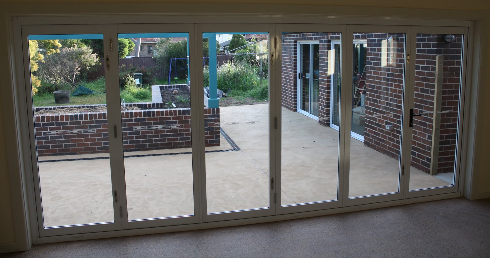
Yes, that's coloured concrete: it's 'Honey Mustard', like the family room.

From another angle:


The colour was the Geek's choice, and I think it's pretty good too.


Originally, we were going to have a spray-on colour -- a uniform colour, as we hate stencilled concrete. The concreter, though, was worried about the colour choices available as there was nothing even close to the 'Honey Mustard' we used on the family room slab. He proposed we mix in the same colour here. As the volume is small the colour wouldn't cost more than the spraying. Of course, the colours look different as the family room slab has been polished to expose the aggregate; it's redder than this, but this is a better outdoor colour anyway.

Sunday, July 31, 2011

A Full Tour of my Paint Choices

It's lovely to see you here! Please come in!


Our front door is Manor Red to match the exterior paintwork and gutters. The inside woodwork is China White and the entry walls are Clotted Cream.


Please peep in again at my study. I'm so pleased with how the Cuddlepot looks!


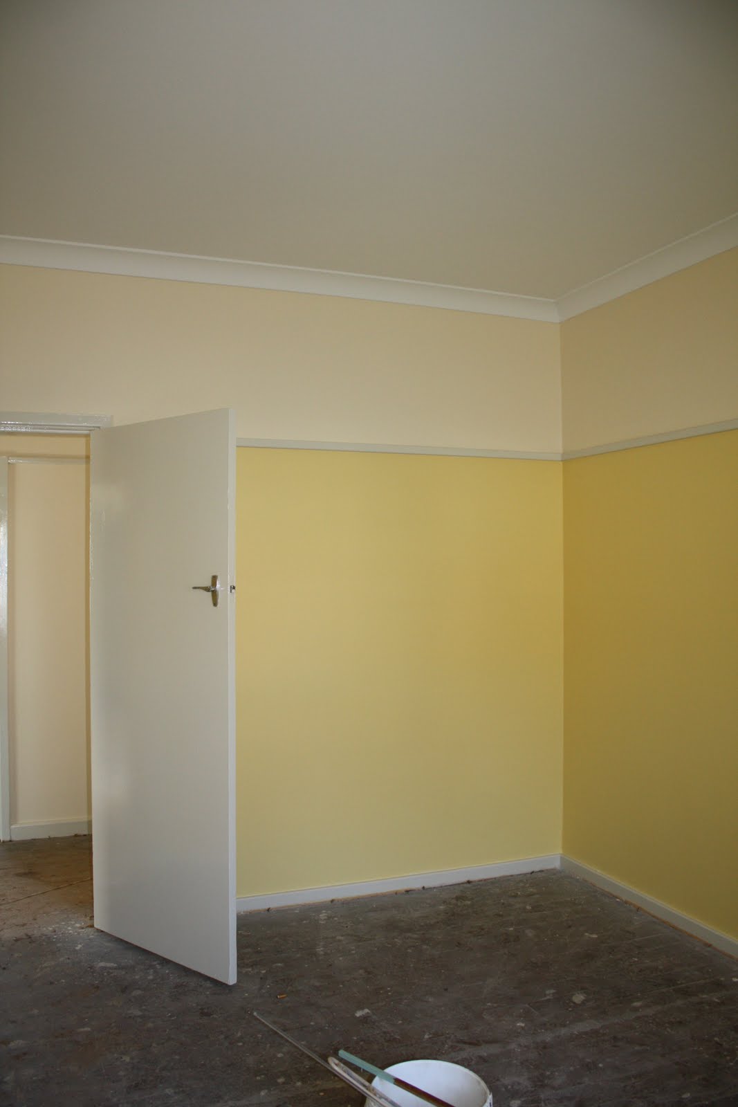
Let's look in the older part of the house first. Because the boys' playroom faces south (no direct light), I wanted a nice sunny colour that didn't look too much like egg-yolk. This is Sundaze.


In our bedroom, I wanted something peaceful but fresh-looking: Spring Green. It looks like it will go nicely with the beech wardrobes.


The boys are thrilled with their Harbour Blue walls. This is a north-facing room so even a dark colour won't be too dark.


The bathroom and toilet next door are both painted in Diorite. Those are floor tiles on the wall -- when we retiled, the only wall-tiles available in all of Sydney were off-white! Boring!


Now let's head back down the hall to the new bit. Lots more Clotted Cream and China White on the way.


The next stop is the enlarged laundry, the only place where I think I've made a boo-boo. This Mint Circle looked just like the colour on the old cupboard doors, but it's just a little too dark and a little too green. Can't win 'em all; at least we've had professionals do the first few coats.


Back to the Clotted Cream in the family room (and in the kitchen, behind the wall -- nothing to see there yet).


There is a story to the Clotted Cream.

Many years ago, my work moved to a brand-new building, painted mainly in off-white, but with feature walls in fire-engine red, midnight blue and mustard yellow. In sunlight, it looked fine, apart from the mustard yellow (ugh!) and the too-startling red. Problem was that whenever clouds came over, the off-white turned a gloomy pallid khaki. It was quite depressing in wet spells.

I was determined to prevent such a problem from occurring in my house, so when I picked up all 150,000 off-white paint chips, I first discarded the ones which I Just Didn't Like. Then I checked the appearance of the rest in the new family room in sun, light cloud, and rain, and gave them a rating from one to three, with one being the best. The eight chips with the best results formed a shortlist, and I had a hard look at them in various lighting conditions before deciding on Clotted Cream. I was struck by how some colours which looked lovely on a sunny day could become bluish or brownish on a cloudy one. If you are choosing an off-white, take care! Other colours seem much more forgiving. Of course, if you are doing the painting yourself, you can take your time and use sample pots.

Lastly, here is a view of the Mallard Green on my pergola. I needed a strong colour to stand up to the dark brick and Manor Red guttering. The Ivory fascia and soffits are just visible.


I'm sorry I can't offer you refreshments or even a seat today, but I hope you have enjoyed the tour.