
Our front door is Manor Red to match the exterior paintwork and gutters. The inside woodwork is China White and the entry walls are Clotted Cream.

Please peep in again at my study. I'm so pleased with how the Cuddlepot looks!

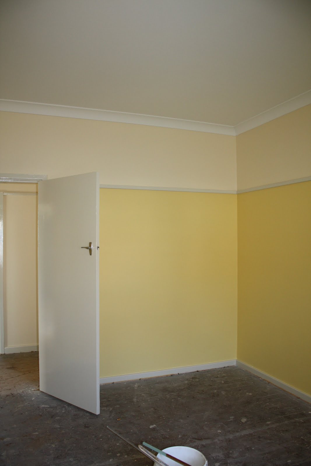
Let's look in the older part of the house first. Because the boys' playroom faces south (no direct light), I wanted a nice sunny colour that didn't look too much like egg-yolk. This is Sundaze.
In our bedroom, I wanted something peaceful but fresh-looking: Spring Green. It looks like it will go nicely with the beech wardrobes.

The boys are thrilled with their Harbour Blue walls. This is a north-facing room so even a dark colour won't be too dark.

The bathroom and toilet next door are both painted in Diorite. Those are floor tiles on the wall -- when we retiled, the only wall-tiles available in all of Sydney were off-white! Boring!

Now let's head back down the hall to the new bit. Lots more Clotted Cream and China White on the way.

The next stop is the enlarged laundry, the only place where I think I've made a boo-boo. This Mint Circle looked just like the colour on the old cupboard doors, but it's just a little too dark and a little too green. Can't win 'em all; at least we've had professionals do the first few coats.

Back to the Clotted Cream in the family room (and in the kitchen, behind the wall -- nothing to see there yet).

There is a story to the Clotted Cream.
Many years ago, my work moved to a brand-new building, painted mainly in off-white, but with feature walls in fire-engine red, midnight blue and mustard yellow. In sunlight, it looked fine, apart from the mustard yellow (ugh!) and the too-startling red. Problem was that whenever clouds came over, the off-white turned a gloomy pallid khaki. It was quite depressing in wet spells.
I was determined to prevent such a problem from occurring in my house, so when I picked up all 150,000 off-white paint chips, I first discarded the ones which I Just Didn't Like. Then I checked the appearance of the rest in the new family room in sun, light cloud, and rain, and gave them a rating from one to three, with one being the best. The eight chips with the best results formed a shortlist, and I had a hard look at them in various lighting conditions before deciding on Clotted Cream. I was struck by how some colours which looked lovely on a sunny day could become bluish or brownish on a cloudy one. If you are choosing an off-white, take care! Other colours seem much more forgiving. Of course, if you are doing the painting yourself, you can take your time and use sample pots.
Lastly, here is a view of the Mallard Green on my pergola. I needed a strong colour to stand up to the dark brick and Manor Red guttering. The Ivory fascia and soffits are just visible.

I'm sorry I can't offer you refreshments or even a seat today, but I hope you have enjoyed the tour.
3 comments:
Those colours are gorgeous, Chookie. We had a blue very similar to that in the dining/lounge of a rented house once. When we first moved in I didn't know how I was going to bear it. Before long, I loved it, especially contrasted with the natural wood floor and the creamy room next door. I think you'll love living in it - I have very warm memories of those walls.
Thanks, Bungy! I'm looking forward to being back in.
Gain your access to 16,000 woodworking designs.
Teds Woodworking has more than 16,000 woodworking plans with STEP-BY-STEP instructions, photos and blueprints to make each project very easy!
Post a Comment