Showing posts with label Family Room. Show all posts

Monday, August 22, 2011

Lighting

Lighting is really difficult! Illumination is like sound; it has so many qualities that finding what you want is more luck on the part of the consumer than anything else. Lights can be more or less strong, more or less directional, and it simply isn't something you can work out in a lighting shop, surrounded by other light sources. Some spotlights, for example, are really for security lighting; others are less concentrated and will provide comfortable light for outdoor dining.

Lighting shops, in my experience, are usually filled with astonishingly ugly fittings. Some years ago we discovered Beacon Lighting. Their shops tend to be at least 60% attractive fittings, and even the unattractive ones aren't that bad, except maybe for this one:

How on earth could anyone think this was attractive? Let alone practical! But I digress.

We ended up with the following, all from Beacon Lighting:


Kitchen Triple LED spotlights on bracket, LEDS for under wall cupboards
Family Room LED downlights, stainless steel Typhoon fan
Study Laconia pendant
Entry Recycle a fitting
Kids' Playroom Rocket light
Stairs Project wall sconce
Patio Sentinel spotlights
HTML Tables

And here are the problems we encountered along the way.

Choice: it's hard to know exactly what you want, and whether it will provide adequate illumination. In some areas, like exposed outdoor lighting, the range is very small. This can mean you choose very quickly, or that you go away thinking, "None of the above!" Even without the returns we made, several shopping trips would have been necessary just to decide on fittings. On the positive side, Beacon were always very accommodating with returns and so on, and their staff are friendly and helpful (if occasionally short on technical knowledge).

Vue from Beacon, for our kitchen, was an easy decision. Few of these rail-type fittings have such clean lines:


The second was supply: lots of things had to be ordered in for us as the Beacon stores don't hold very much stock. And the most convenient Beacon store is 20-30 minutes away, down the motorway. We had to come back for these Sentinel lights for our patio:


Thirdly, we had a problem due to inadequate technical information. The LED downlights were 62mm, not the standard 80mm. The fact that they had no user-replaceable parts wasn't mentioned either. Seriously -- once the LEDs failed we were supposed to pay an electrician to remove the fitting from the ceiling and throw it away. This sounds very wasteful to me even if the fitting is supposed to last 30 years -- for one thing, what if one light fails long before the others? Is anyone going to gamble against Murphy's Law?


Of course we didn't know about the size until after our electrician had drilled the 80mm holes in the ceiling. He replaced the downlights with standard-size, user-replaceable LED fittings, which were cheaper than the ones we had found. Light fittings are expensive and it's worth seeing what your electrician can get at trade prices, especially things like downlights, which all look the same and which nobody will actually be examining closely.

Next, the Laconia pendant's glass shade was broken when the electrician opened the box. Bad luck, I suppose, but it meant a trip back to Beacon for another one.


Then we looked at the light fitting we planned to recycle, and discovered that the rod kit for the old fitting had disappeared during the building process, leaving us with the bowl. Our electrician, understandably, won't fit the bowl to a fitting it wasn't designed for, so we are waiting to hear back about a rod kit that will fit.

The Domus lights, which we bought from OzLighting, have a transformer which must be set 60cm above soil level. For most applications, this is fine: you attach it to the house wall and run the cables where you want them. This won't work on an island bed, however. Guess where we want it? Our electrician is getting a suitable transformer for us.

This is one of the fittings that didn't cause any dramas. Of course, we haven't tried putting a globe in it yet!

Sunday, August 14, 2011

Transformation: The Stairs


The original steps from my house to the garden, via the porch, were at right angles to the door. How convenient...


(The only difference in this final photo is the addition of tan-pink Marmoleum on the steps.)


Sunday, July 31, 2011

A Full Tour of my Paint Choices

It's lovely to see you here! Please come in!


Our front door is Manor Red to match the exterior paintwork and gutters. The inside woodwork is China White and the entry walls are Clotted Cream.


Please peep in again at my study. I'm so pleased with how the Cuddlepot looks!


Let's look in the older part of the house first. Because the boys' playroom faces south (no direct light), I wanted a nice sunny colour that didn't look too much like egg-yolk. This is Sundaze.


In our bedroom, I wanted something peaceful but fresh-looking: Spring Green. It looks like it will go nicely with the beech wardrobes.


The boys are thrilled with their Harbour Blue walls. This is a north-facing room so even a dark colour won't be too dark.


The bathroom and toilet next door are both painted in Diorite. Those are floor tiles on the wall -- when we retiled, the only wall-tiles available in all of Sydney were off-white! Boring!


Now let's head back down the hall to the new bit. Lots more Clotted Cream and China White on the way.


The next stop is the enlarged laundry, the only place where I think I've made a boo-boo. This Mint Circle looked just like the colour on the old cupboard doors, but it's just a little too dark and a little too green. Can't win 'em all; at least we've had professionals do the first few coats.


Back to the Clotted Cream in the family room (and in the kitchen, behind the wall -- nothing to see there yet).


There is a story to the Clotted Cream.

Many years ago, my work moved to a brand-new building, painted mainly in off-white, but with feature walls in fire-engine red, midnight blue and mustard yellow. In sunlight, it looked fine, apart from the mustard yellow (ugh!) and the too-startling red. Problem was that whenever clouds came over, the off-white turned a gloomy pallid khaki. It was quite depressing in wet spells.

I was determined to prevent such a problem from occurring in my house, so when I picked up all 150,000 off-white paint chips, I first discarded the ones which I Just Didn't Like. Then I checked the appearance of the rest in the new family room in sun, light cloud, and rain, and gave them a rating from one to three, with one being the best. The eight chips with the best results formed a shortlist, and I had a hard look at them in various lighting conditions before deciding on Clotted Cream. I was struck by how some colours which looked lovely on a sunny day could become bluish or brownish on a cloudy one. If you are choosing an off-white, take care! Other colours seem much more forgiving. Of course, if you are doing the painting yourself, you can take your time and use sample pots.

Lastly, here is a view of the Mallard Green on my pergola. I needed a strong colour to stand up to the dark brick and Manor Red guttering. The Ivory fascia and soffits are just visible.


I'm sorry I can't offer you refreshments or even a seat today, but I hope you have enjoyed the tour.

Tuesday, July 26, 2011

A Whiff of Paint

Remember the paint colours I chose last month?

Despite atrocious weather in Sydney last week, the painters managed to do an external coat of Ivory on the windows and eaves. The white downpipe will be painted Manor Red to match the guttering.


The Geek says the return to original paint colours has aged the house. In a nice way. At least, I think that's what he meant. Meanwhile, I'm immensely relieved at the way the study has turned out (it's not quite complete here; the woodwork needs another coat of China White).


I feared it might look like the inside of a nappy, but fortunately, it looks like cocoa powder.

The boys are thrilled with the Harbour Blue in their bedroom.


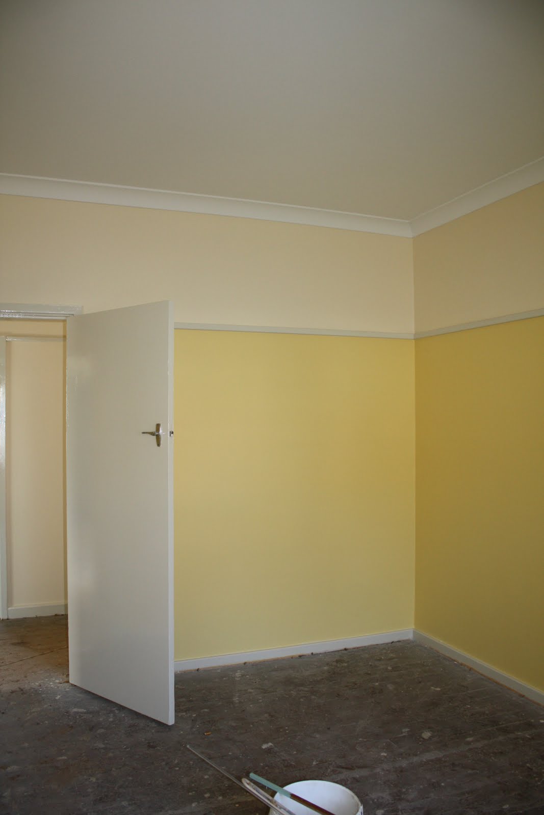
And here is a single coat of Clotted Cream in the family room. You can see more Clotted Cream above the picture rails in the other rooms.


Hope you have enjoyed a sniff of my new colours! I will give you a proper tour once the painters have finished.

This post is a part of the Paint, Please link party at Modern Country Style.


Friday, July 8, 2011

Bifold Doors and Chokoes

We have reached lockup stage now. All our doors are in, including the bifolds for the family room. Aren't they lovely?


In winter, the sunlight will stream in to warm the slab in the family room. In summer, the pergola will be covered with vines for shade. In fact, I already have a choko (chayote to some) growing on the windowsill towards next summer. My long-term plan is for a passionfruit vine to cover the pergola, but even if I plant one as soon as I can, there won't be enough of it to provide shade this year. The choko vine, however, will be luxuriant in months.

The choko vine and the passionfruit vine are staples in Sydney, though chokos -- traditionally grown over one's shed -- are much less common than they were. The newer dwellings don't have enough space for a choko vine, for one thing, and secondly, a lot of us grew up eating chokoes way too often! I saw some nasty big yellowish ones at the shops today for $3.99/kg, way too much, and at least twice as big as they should have been. Of course, the one I bought was even worse: I could see it was starting to sprout, which was why I wanted it! I don't understand why greengrocers persist in selling such old chokoes.

I saw the aggregate and the planter box mix being wheeled in this morning to fill the herb bed, but I can't really plant my choko until the pergola is painted. I might sneak in a few late bulbs, though. Or if I can find my strawberry plants... if they've survived... I might pop them in.


Sunday, July 3, 2011

Lots of Glass

The first glass installed (apart from replacement of cracked panes in the older part of the house) was the window in our family room. The saw is set up for cutting the window architrave, but look at all those glass doors!


Here's the architrave installed. Note the picturesque view of our future driveway and the fence.


Here's where some of the sliding doors went:


The idea is that we can use the garage as extra space for parties. Handy in wet weather or when the kids take to playing country music.

The other doors are aluminium bifold doors for the family room (as the Geek says, not quite as nice as the cedar ones, but considerably cheaper). There will be lots of sun coming in to our family room, especially in winter, to heat the concrete floor. The house won't be quite so dark or cold. This frame was installed on Friday, so I suppose the doors will go in on Monday.


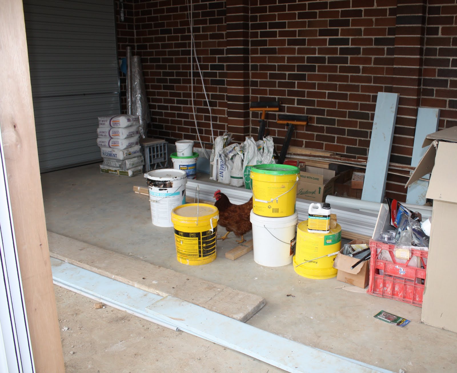
In the meantime, Lizzie keeps an eye on the materials stored in the garage.


We have found evidence of her inspection visits in various parts of the house, but we won't elaborate...

Sunday, June 26, 2011

Flooring Decided

We have finally made all our decisions on flooring.

I wanted polished concrete in the family room for a number of reasons:
  • the slab is thermal mass for the house and covering it with another layer would insulate it from the sun
  • polished concrete requires no maintenance
  • it will link visually with the concrete patio just outside
My concrete will not be given a really high-gloss finish, lest the room feel like a shopping centre. I'll have a satin gloss. The concrete is coloured Honey Mustard and contains Nepean River Gravel, which includes white, yellow and red quartz. We've asked for the slab outside to be sprayed a similar colour.

Up the steps and into the kitchen and entrance we will have Marmoleum Real in 'Tan Pink':


As you can imagine, this is a related colour.

The study, bedrooms and hall will be given a woollen carpet: Channing in 'Tunic'. This wollen carpet is a textured cut-and-loop with tiny deep blue squares on a greyed caramel background. It looks good with all our paint chips, and the blue-grey element is picked up in the Marmoleum.

We're just having plain white tiles in the laundry/toilet, which will go well with the mint-green walls.

Of course, we'll have to move our boxes out for the carpet to go in. I'm not looking forward to that!

UPDATE: According to Green magazine's article in this month's edition, we have made good choices.

Sunday, June 19, 2011

Paint Colours

A few hundred shades of off-white later...


Centre: Clotted Cream (living areas and above the picture rail in most rooms)

Clockwise from top: Cuddlepot (study); Diorite (bathroom and toilet); Mint Circle (laundry); Harbour Blue (boys' bedroom); Mallard Green (pergola); Spring Green (main bedroom); Sundaze (boys' playroom).

Ceiling and cornices in Ceiling White, as usual, and the architraves, picture rails and skirting boards will be in China White gloss. The woodwork was initially stained and varnished, and all the walls would have been painted cream, going by photos of similar houses on Picture Australia. The picture rails and skirting boards, however, are a bit narrow to be so dark. The previous owners painted them with the wall colour, but that looked odd. We're hoping white looks a bit less peculiar.

Outside, the windows, fascia and soffits will be painted in the original pale primrose colour, which for some reason was known as Ivory.

All colours from Dulux.

Saturday, June 18, 2011

Mostly Indoors

Our rest on the Queen's Birthday long weekend consisted of packing our remaining goods and chattels (mainly books and some toys) so that our former library could be made good and skim-rendered. We had major cracking in that room, but a lot was hidden behind the bookshelves. Here it is after being repaired.


We're getting a new ceiling, as you can see. When John got up to scrape it, his trowel went through the plasterboard. Three cracked tiles on the roof had been directing water on to it for years!

The renderers also came to do the family room walls. I am intrigued at how you can "see" the masonry as the render dries; I suppose the brick absorbs water at a different rate to the mortar.


I had a lovely chat with Jason the electrician, who advised me on a better placement of external lights, how many downlights I'd need, and so on. I'll have to do a separate whinge post on lighting. I was intrigued by the little panels he used to organise the wiring. The renderers plastered right over some of them, but that's no problem -- as they are steel, you just need a magnet to find them again.


We're also putting a skylight in the darkest part of our house: the linen press. It is so annoying to be unable to see whether you have grabbed a blue or a green tablecloth! And as the cupboard runs to the ceiling, there is no room for even an oyster light in front of it. Skylights have some disadvantages -- they allow convective heat transfer, for example -- so we chose a small tube-style light.

Because there was a batten running down the middle of the hall, Louie asked me which side of it I wanted the skylight on (naturally I said the side away from the cupboard, which would allow more light into it). The next day John just cut the batten, saying it would look far better if placed in the middle...


Lastly, here is a shot of my herb bed. It has been lined with a bituminous waterproofing membrane and I asked the brickies and tilers to chuck in any broken bits. Over this layer, I plan to have a layer of 10-20mm recycled concrete 'gravel', then planter box mix. I did wonder if I ought to have a layer of geotech fabric under the planter box mix to prevent the fines clogging the weep holes, but Stan, the gardener from work, assured me it wasn't necessary.


The lack of opportunity to work in the garden is getting to me. I found myself in a nursery today and restrained myself... if you don't count the three plants from the bargain table...

Monday, June 13, 2011

All About Bricks

Our house is built of bricks called Eastwood Reds.

The Eastwood Brickworks closed some years ago, after being in operation about 80 years. My Dad lives near it and I remember occasionally hearing blasting in the quarry when I was a child, then seeing the dust rising. But why is our 1946 house built of Eastwood Reds, Sydneysiders will ask, when the closest brickworks was in fact at Homebush? It turns out that the Homebush Brickworks was closed during the war. I imagine the manpower that was left was simply moved to a smaller number of brickworks -- after all, there was very little building going on.

There is, of course, a problem when you try to match bricks: the clays are always different colours in different places, and even at different times. And as you can see below, it's difficult to match bricks from pictures. These samples are from the Austral website, and are of their Hereford Bronze and Shorthorn Mix respectively. The actual bricks are significantly darker.


We initially selected Hereford Bronze, finding the Shorthorn too dark when we received the samples. Our original bricks are rather gingery in colour, with a darker range of shades used below the floor line. Then we hit a snag. After a couple of weeks of being told they were on back order, Austral confessed that the clays for the Hereford shades had run out. They had to break into the Shorthorn pallets to find lighter bricks to make up our order, so the result was rather darker than we had anticipated. As most of the bricks we see at the back are new, it doesn't really matter. I think they tone quite well with the old pinkish-grey commons to the right:


And even where one sees both old and new together, the new looks rather like our darker subfloor bricks:


But scroll up to the top again. They don't look like the photos from Austral, do they?