Showing posts with label Study. Show all posts

Sunday, July 31, 2011

A Full Tour of my Paint Choices

It's lovely to see you here! Please come in!


Our front door is Manor Red to match the exterior paintwork and gutters. The inside woodwork is China White and the entry walls are Clotted Cream.


Please peep in again at my study. I'm so pleased with how the Cuddlepot looks!


Let's look in the older part of the house first. Because the boys' playroom faces south (no direct light), I wanted a nice sunny colour that didn't look too much like egg-yolk. This is Sundaze.
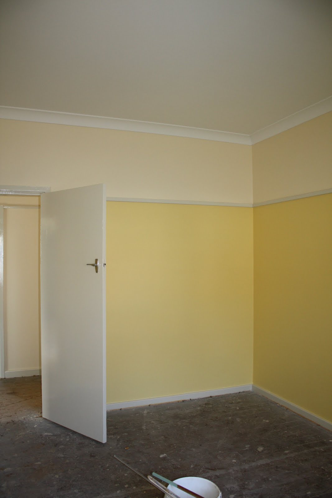

In our bedroom, I wanted something peaceful but fresh-looking: Spring Green. It looks like it will go nicely with the beech wardrobes.


The boys are thrilled with their Harbour Blue walls. This is a north-facing room so even a dark colour won't be too dark.


The bathroom and toilet next door are both painted in Diorite. Those are floor tiles on the wall -- when we retiled, the only wall-tiles available in all of Sydney were off-white! Boring!


Now let's head back down the hall to the new bit. Lots more Clotted Cream and China White on the way.


The next stop is the enlarged laundry, the only place where I think I've made a boo-boo. This Mint Circle looked just like the colour on the old cupboard doors, but it's just a little too dark and a little too green. Can't win 'em all; at least we've had professionals do the first few coats.


Back to the Clotted Cream in the family room (and in the kitchen, behind the wall -- nothing to see there yet).


There is a story to the Clotted Cream.

Many years ago, my work moved to a brand-new building, painted mainly in off-white, but with feature walls in fire-engine red, midnight blue and mustard yellow. In sunlight, it looked fine, apart from the mustard yellow (ugh!) and the too-startling red. Problem was that whenever clouds came over, the off-white turned a gloomy pallid khaki. It was quite depressing in wet spells.

I was determined to prevent such a problem from occurring in my house, so when I picked up all 150,000 off-white paint chips, I first discarded the ones which I Just Didn't Like. Then I checked the appearance of the rest in the new family room in sun, light cloud, and rain, and gave them a rating from one to three, with one being the best. The eight chips with the best results formed a shortlist, and I had a hard look at them in various lighting conditions before deciding on Clotted Cream. I was struck by how some colours which looked lovely on a sunny day could become bluish or brownish on a cloudy one. If you are choosing an off-white, take care! Other colours seem much more forgiving. Of course, if you are doing the painting yourself, you can take your time and use sample pots.

Lastly, here is a view of the Mallard Green on my pergola. I needed a strong colour to stand up to the dark brick and Manor Red guttering. The Ivory fascia and soffits are just visible.


I'm sorry I can't offer you refreshments or even a seat today, but I hope you have enjoyed the tour.

Tuesday, July 26, 2011

A Whiff of Paint

Remember the paint colours I chose last month?

Despite atrocious weather in Sydney last week, the painters managed to do an external coat of Ivory on the windows and eaves. The white downpipe will be painted Manor Red to match the guttering.


The Geek says the return to original paint colours has aged the house. In a nice way. At least, I think that's what he meant. Meanwhile, I'm immensely relieved at the way the study has turned out (it's not quite complete here; the woodwork needs another coat of China White).


I feared it might look like the inside of a nappy, but fortunately, it looks like cocoa powder.

The boys are thrilled with the Harbour Blue in their bedroom.


And here is a single coat of Clotted Cream in the family room. You can see more Clotted Cream above the picture rails in the other rooms.


Hope you have enjoyed a sniff of my new colours! I will give you a proper tour once the painters have finished.

This post is a part of the Paint, Please link party at Modern Country Style.


Sunday, June 26, 2011

Flooring Decided

We have finally made all our decisions on flooring.

I wanted polished concrete in the family room for a number of reasons:
  • the slab is thermal mass for the house and covering it with another layer would insulate it from the sun
  • polished concrete requires no maintenance
  • it will link visually with the concrete patio just outside
My concrete will not be given a really high-gloss finish, lest the room feel like a shopping centre. I'll have a satin gloss. The concrete is coloured Honey Mustard and contains Nepean River Gravel, which includes white, yellow and red quartz. We've asked for the slab outside to be sprayed a similar colour.

Up the steps and into the kitchen and entrance we will have Marmoleum Real in 'Tan Pink':


As you can imagine, this is a related colour.

The study, bedrooms and hall will be given a woollen carpet: Channing in 'Tunic'. This wollen carpet is a textured cut-and-loop with tiny deep blue squares on a greyed caramel background. It looks good with all our paint chips, and the blue-grey element is picked up in the Marmoleum.

We're just having plain white tiles in the laundry/toilet, which will go well with the mint-green walls.

Of course, we'll have to move our boxes out for the carpet to go in. I'm not looking forward to that!

UPDATE: According to Green magazine's article in this month's edition, we have made good choices.

Sunday, June 19, 2011

Paint Colours

A few hundred shades of off-white later...


Centre: Clotted Cream (living areas and above the picture rail in most rooms)

Clockwise from top: Cuddlepot (study); Diorite (bathroom and toilet); Mint Circle (laundry); Harbour Blue (boys' bedroom); Mallard Green (pergola); Spring Green (main bedroom); Sundaze (boys' playroom).

Ceiling and cornices in Ceiling White, as usual, and the architraves, picture rails and skirting boards will be in China White gloss. The woodwork was initially stained and varnished, and all the walls would have been painted cream, going by photos of similar houses on Picture Australia. The picture rails and skirting boards, however, are a bit narrow to be so dark. The previous owners painted them with the wall colour, but that looked odd. We're hoping white looks a bit less peculiar.

Outside, the windows, fascia and soffits will be painted in the original pale primrose colour, which for some reason was known as Ivory.

All colours from Dulux.

Wednesday, March 16, 2011

Necessary

This is what you think it is.

It is the waste pipe for our second toilet. Our builders had to cut the concrete away to install the pipe and connect it to the sewer behind.

Below is something a bit less earthy. It's the framing for our future study, or as the Council call it, Bedroom 4, and the framing for the wall that will end the run of cupboards in the kitchen.

That's exciting too, but a necessary is necessary!